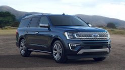
In the previous part, we had chance to find out histories of the BMW, Ford, Honda, Hyundai, Kia and Mahindra logos. Today, Philkotse.com will continue our car logos series by another 6 logos of Audi, Chevrolet, Isuzu, Mazda, Mitsubishi and Nissan.
>>> If you have missed Part 1, click here to look back.
7. Audi
A prominent German luxury brand, Audi is part of the Volkswagen Group of Germany, and is based in Ingolstadt. The company operates nine production facilities worldwide, possibly accounting for the brand’s exclusivity.
Audi began in 1899 as A. Horch & Cie, a company founded by German engineer August Horch. The early years were turbulent for Horch; although he had established three companies under his own name, he was sued by his former partners for trademark infringement, and the German Supreme Court in Leipzig ruled that he cannot use the Horch name for his next automotive venture.
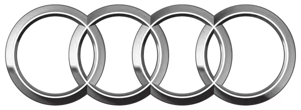
The logo bears close resemblance to the Olympic rings
Horch called a meeting with his close business friends, Paul and Franz Fikentscher. As they were discussing possible names, Franz’s son happened to be studying Latin nearby, and finally suggested the name Audi (Horch translates in German to “hear”, while Audi is the imperative form “to listen” in Latin). Horch and his friends accepted the suggestion, and Audi Automobilwerke GmbH Zwickau was registered in 1910.
In 1932, Audi merged with three other companies Horch, DFW, and Wanderer to form Auto Union AG; they are the four oldest carmakers in Germany that banded together to form a single automotive entity. The four rings in the Audi logo symbolize their strength and unity, as well as the company’s efforts to reinforce ties with its customers.
The resemblance to the Olympic logo was so similar that the World Olympic Committee filed a case against Audi for copyright infringement at the World Trademark Court in 1995. However, the WOC lost the case.
8. Chevrolet
Apart from Ford, Chevrolet is another American brand that Pinoys are familiar with, especially with their current SUV and pickup offerings in the form of the Trailblazer and the Colorado, respectively. The Chevrolet Camaro, originally a muscle car of the 60s and rival to the Ford Mustang, was reintroduced to a new generation of Pinoy fans via the live-action Transformers movie, where it was used as the Autobot Bumblebee’s alternate form.
Swiss-American racecar driver Louis Chevrolet started the company in 1911, along with William C. Durant. Chevrolet would not release its first car until two years later, as the first preproduction model that year had to be refined throughout the early part of 1912.
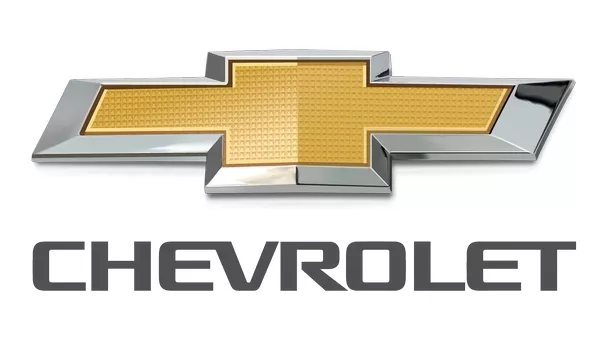
The bowtie logo has had multiple origin stories
The origin of Chevrolet’s trademark bowtie logo (two thick stripes overlapping each other in the shape of a cross) has been the subject of multiple theories. One explanation goes that Durant first noticed the bowtie design as a wallpaper in a French hotel he was staying in back in 1908. Another is that he had picked up the design from a newspaper ad as he and his wife were on vacation in 1912. A third theory is that Durant himself sketched the logo at the dinner table in 1929, as he was known to be a frequent doodler.
However it came to be, the Chevrolet bowtie logo is still associated with the brand’s confidence in its products, conveying consistency and tradition. The logo’s present gold color represents enthusiasm and strength.
>>> Latest Chevrolet car price list Philippines 2018
9. Isuzu
Isuzu Motors Ltd., based in Japan, has become synonymous with diesel engines, SUVs and commercial vehicles especially in most of the Asian and African market. There was a time when Isuzu made passenger vehicles such as sedans and compact cars (remember the Isuzu Gemini taxis plying Philippine roads back in the 80s?), but since 2009, the company has focused exclusively on trucks.
Even though the company’s automotive history began in 1916, it wasn’t until 1949 that it formally adopted the Isuzu as its corporate name, after the Isuzu River in Japan. “Isuzu” itself means “fifty bells”, and this association was evident in some of their previous cars such as the Bellel and the Bellett.
The first Isuzu logo, used from 1949 to 1974, consisted of the company’s name in hiragana, vertically arranged inside an oval bordered with scallops. After signing a capital agreement with General Motors in 1972, Isuzu changed it to the more familiar twin vertical pillars with slanted tops, a stylized version of the Isuzu’s first syllable.
This was said to be a white symbol divided in half by a red background, representing corporate and societal growth as well as excellence, emphasizing the quality of the company’s products.
The current Isuzu car logo is a wordmark rendered in a more angular typeface, with the letters S and Z being mirror images of each other. It is said to reflect the company’s continuing pursuit of perfection and integrity.
>>> Click to find complete price list of all Isuzu models in the Philippines
10. Mazda
This Japanese multinational automaker was the 15th biggest global automaker in terms of production in 2015. It started out as a manufacturer of machine tools and heavy machinery in 1920, eventually switching to vehicle production 11 years later.
The company had used the name Mazda on its cars since the beginning, said to be derived from two sources: the company’s founder Jujiro Matsuda, and Ahura Mazda or the “God of Light” in Zoroastrianism. In the case of the latter, the company hoped that the name would brighten the image of the compact vehicles they manufactured.
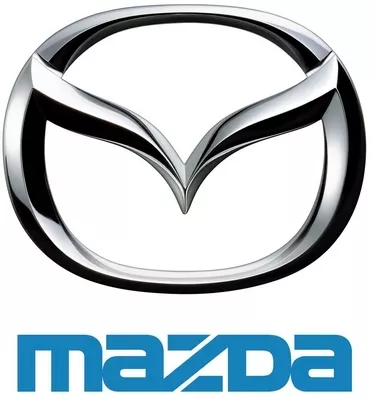
The logo went through several iterations, but the most familiar is the Mazda logotype which is still used with the current symbol
Mazda’s logo underwent several changes since the wordmark that was originally used in 1934, when it began to produce three-wheeled trucks. It was converted into three M letters with wings in 1936, as a homage to its home city of Hiroshima. After World War II, it was changed into a stylized lower case M inside a circle, coinciding with the release of Mazda cars. In 1975, Mazda used the now-familiar squarish wordmark for its products and internal documents.
The desire for a logo resulted in a briefly-used symbol in 1991, consisting of a diamond inside an oval, representing wings, the sun and a circle of light. Probably realizing that it looked too much like the Renault logo, Mazda changed the inner design a year later by rounding out the diamond’s edges.
Beginning 1997, Mazda launched the logo that it still uses today: a stylized M resembling wings in flight, placed inside an oval. The company says that this symbolizes its pursuit of continuous improvements for powerful growth, as well as flexibile thinking, creativity, vitality, kindness and resilience. The current logo is still paired with the Mazda corporate mark, which now sports a silver gradient.
Speaking of the Mazda wordmark, notice that all the letters are in lower case, except the D. This was purely a design decision, as the company wanted to convey precision and reliability by aligning the top and bottom lines; a lower case D would have ruined the smooth rectangle silhouette formed by the other four letters.
11. Mitsubishi
One of the world’s most familiar automotive brands, Mitsubishi Motors Corporation of Japan boasts of nearly 50 years of experience in international motorsports. Pinoys are definitely familiar with Mitsubishi’s offerings to the Philippine market through the years from the Lancer and Galant to the Adventure, Montero and Pajero, practically all of them engineered with Mitsubishi’s racing DNA.

Mitsubishi's logo is a combination of two family crests
Starting off as a shipbuilding company, Mitsubishi made its automotive debut in 1917 with the Model A, Japan’s first series-production automobile which sold only 22 units and was discontinued four years later. Like many Japanese industries, Mitsubishi became involved in the Second World War, manufacturing military vehicles and components. After the war ended, they returned to making vehicles for civilian use.
Mitsubishi has patented their iconic car logo, symbolizing quality and reliability, with nearly 5,500 registrations across more than 140 countries. It uses three diamonds joined in a central point; the design was chosen by company founder Iwasaki Yataro, as it combined his own family crest consisting of three diamonds stacked over each other, and the crest of the Tosa Clan (his first employers). Even the name Mitsubishi reflects the logo’s symbolism: “Mitsu” (three) and “hishi” (water chestnut).
>>> Here is the updated Mitsubishi car price list Philippines 2018 (with new excise taxes)
12. Nissan
Ask Pinoy drivers what first comes to mind when they hear the name Nissan, and they will likely comment on how cold the airconditioning is. The brand has become something of a gold standard in the Philippines where efficient interior cooling is concerned, which is essential to a comfortable ride in our tropical environs. More than that, however, Nissan is the world’s largest maker of electric vehicles, selling more than 275,000 units as of December 2016.
For many Pinoys, Nissan brings to mind exceptionally cold airconditioning
Anyway, Nissan Motor Company Ltd. Traces its roots to the Kaishinsha Motor Car Works, which started in 1911 as Japan’s first carmaker. The first car it produced was called the DAT, an acronym of the company’s investors: Kenjiro Den, Rokuro Aoyama and Meitaro Takeuchi. Majority of the vehicles they originally manufactured were trucks, partly because there was no market for passenger cars at the time, as well as part of recovery efforts after the Great Kanto Earthquake in 1923.
The Nissan name first came into use in 1930, as a contraction of holding company Nihon Sangyo (abbreviated as NiSan on the Tokyo Stock Exchange). Corporate policy at the time mandated that their export market vehicles would be sold under the Datsun name, requiring the use of a logo, while Nissan would be used exclusively for the Japanese market. The Datsun logo consisted of a white “Datsun” text in uppercase letters, placed inside a blue rectangle and embedded in a red circle that represented the sun. It was very appropriate, since Datsun was a product of Japan, the land of the rising sun.
After the Datsun line was discontinued in 1984, the Nissan brand inherited the logo with very minor tweaks. The basic geometric shapes were retained, but the colors were updated to a silver and grey render, said to symbolize Japanese quality, innovation, elegance, excellence, sophistication and modernism.
So, we have gone through the history of 12 car logos in automotive world totally. Please keep an eye out for the next part with the presence of Subaru, Suzuki, Tata, Toyota and Volkswagen.
Recent posts
- Nissan new logo Almera Mar 18, 2021
- Toyota new logo typeface Oct 14, 2020
- Car logos and names list & 15 FAQs about car logos Dec 23, 2022


