For better or for worse, Pinoys are a brand-conscious bunch, and this is nowhere more apparent than in their choice of cars.
A sedan, SUV or a van might look good or even carry impressive specs, but the fact that it doesn’t belong to a certain brand might be a deal breaker for most. The inverse is also true: a specific brand name might be enough for the most ardent fan to overlook a vehicle’s perceived shortcomings.
A car logo is more than just the car’s corporate identity; it’s a coded symbol of an automaker’s rich history, stirring up various emotions on the eye of the beholder. In an industry where they try to outdo each other in terms of design, features, performance and price, oftentimes that little symbol can tip the scales and make (or break) a sale.
A car logo is more than just the car’s corporate identity; it’s a coded symbol of an automaker’s rich history
Now, since most Pinoy motorists place a premium on that shiny emblem adorning the hood or grilles of their respective rides, let’s take a look at how those car logos came to be. Who knows, you might gain a little more insight into (not to mention a better appreciation of) your choice of automobile.
1. BMW logo
Most Pinoys associate BMW cars with sophistication and performance at a premium price, and with good reason. BMW (Bayerische Motoren Werke in German or Bavarian Motor Works in English) has brought forth some of the most heart-pounding models on the road, justifying its tagline of “The Ultimate Driving Machine” and “Sheer Driving Pleasure”.
Founded in 1916, BMW is based in Munich, Bavaria, and was originally involved in producing aircraft engines. It started out as Rapp Motorenwerke, which had the silhouette of a horse head inside a white circular background surrounded by a black ring with the words “Rapp” and “Motor” on the north and south radius, respectively.
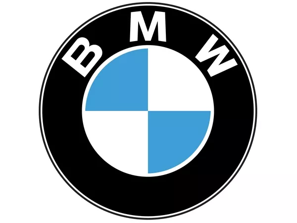
The logo is often mistaken as that of an aircraft propeller
Eventually the car logo was changed into the more familiar blue and white checkered pattern inside a black ring, with the letters B-M-W printed on the ring’s upper half. This version endured the years with minimal revision, and is still in use today.
Seeing how the company started out in aviation, there’s a myth that tells of the BMW roundel logo being inspired by a rotating aircraft propeller against a blue sky backdrop. In reality, the blue and white quadrants inside the BMW logo represent the colors of the Bavarian flag. At the time of the logo’s creation, Germany’s Trademark Act prohibited the use of national coat of arms or other symbols of national sovereignty to be used in a corporate trademark, so BMW decided to use the color elements from a heraldic perspective, while maintaining its association with the state of Bavaria.
2. Ford logo
One of the most recognizable brands (automotive or otherwise) in the world, Ford is seeing a lot of its models on Philippine roads ever since its successful comeback in the country. Older Pinoy motorists might remember such models as the Fiera (one of the early AUVs), Cortina, Escort and Econovan during the 70s and 80s, while the younger set might be more familiar with the Ecosport, Ranger, Everest, Expedition and the updated Mustang (usually recognizable as a ‘trophy’ among individuals engaged in multi-level marketing).
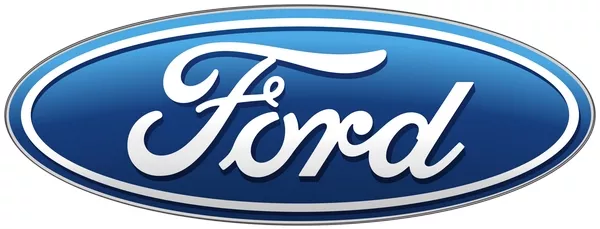
The text inside is not Henry Ford's signature
Also referred to as Big Blue, the Ford logo consists of a stylized FORD text placed inside an oval with a bright blue background, hence the moniker. But the original Ford logo bears little resemblance to the iconic emblem we see today.
The first logo used by Ford from 1903 to 1906 was very ornate, utilizing an art noveau border and rendered in black and white. It was designed by Childe Harold Willis, one of the first employees of the Ford Motor Company and its chief designer.
In 1907, the typeface was changed into a more signature-like form, called “Script with wings” which stylized the F and D by extending them, much like the one being used on the modern version. The oval was added in 1912, highlighting the brand’s reliability and economy when it was first introduced in Britain, and the logo was given the royal blue color in 1927.
The oval silhouette was abandoned in 1957 in favor of a lemon-like shape, but eventually returned in 1976 in a more elongated form. By 2003, in celebration of Ford’s 100th anniversary, the logo was subtly enhanced with a gradient blue background, the silver elements became white.
One common misconception about the Ford logo is that the Ford script inside the oval is founder Henry Ford’s handwriting. For the record, it’s not.
3. Honda logo
Honda is known globally for both their motorcycles and automobiles, apart from their ASIMO experimental robot. Although Honda is occasionally derided in Western markets due to an undeserved association with rice racers, their cars are more favorably received in the Philippines due to their impressive design, innovative interior space solutions and engine performance.
The brand was founded in 1946 by Soichiro Honda, a Japanese engineer, inventor and racecar driver. The original Honda logo looked like a scribble on a blue background bordered with gold elements, which eventually evolved into different versions beginning in 1948, all the while adopting a wing motif.
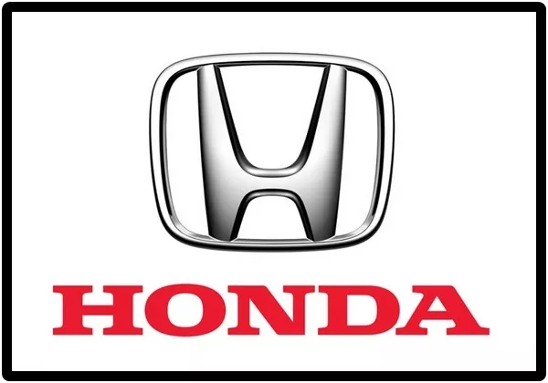
This logo is only one of three that Honda uses, with different ones for their motorcycle and Acura divisions
That wing became a permanent fixture of the Honda logo for its motorcycle division, while the automotive side used a single bold H inside a square border. Although Honda is a Japanese company, the H is rendered in an eye-catching Roman style, which can be interpreted as an effort to appeal to English-speaking markets.
The badge is designed to be broader on top, gradually tapering toward the bottom, with the entire design seen to convey magnificence, durability and confidence. The logo is sometimes accompanied by the trademark block Honda text.
4. Hyundai logo
Hyundai is a multinational conglomerate based in South Korea, the largest automaker in that country and the world’s third largest after Toyota of Japan and Volkswagen of Germany (as of 2016).
Even if it’s a relatively young automaker, being founded in 1967, the Hyundai Motor Company has a presence in almost 200 countries, with a network of 5,000 dealers and showrooms.
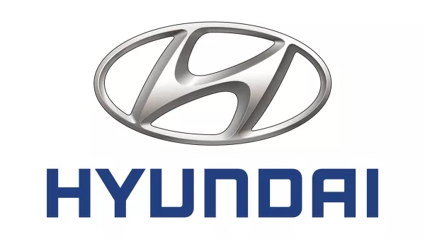
The silhouette represents a handshake between the company and the customer
Similar to Honda, Hyundai uses a bold H enclosed in an oval border, although Hyundai’s version is italicized or slanted. It’s more than just a stylistic touch to differentiate itself from the Honda logo, though. The Hyundai H actually symbolizes a handshake between two individuals: a company representative and the customer. The logo hopes to convey a guarantee of quality in Hyundai’s products, resulting in customer satisfaction. Notice that the letter is actively slanted to the right or forward, denoting fluidity or effortless movement.
The oval element in the logo, meanwhile, represents Hyundai’s aim of global expansion beyond the Asian continent. The logo’s message also differs depending on the color it is rendered in; the silver version conveys sophistication, creativity and perfection, while the blue version (usually seen in print or digital materials) expresses reliability, excellence and supremacy.
As an aside, notice that Hyundai uses a different set of typefaces for each of its models, such as the Elantra, Tucson, Genesis and Veracruz.
5. KIA logo
Kia is another South Korean automaker, which in actuality is minority owned by Hyundai. It is South Korea’s second-largest automaker, and its name is roughly translated in English as “to come out of the east”. Starting out with manufacturing bicycle parts in 1944, Kia rolled out its first own-branded cars in 1973.
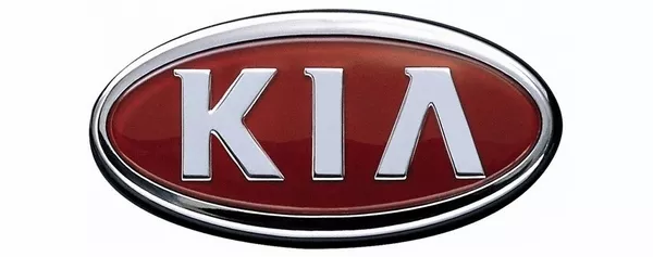
Kia uses two different logos, one for its domestic market, and another for international markets
The original Kia logo consisted of a triple-diamond emblem, similar to that of Mitsubishi of Japan, but with a gear and a smaller diamond inside, in reference to its bicycle business in 1953. Eleven years later, it changed into what looked like an inverted Q colored in green, eventually turning into a bold Kia text in 1986. The KIA text was rendered in a new font (with the A lacking the horizontal bar) and placed inside an ellipse in 1994, essentially remaining unchanged to this day.
The current 3D Kia logo imparts the company’s youth and energy, with the ellipse symbolizing the Earth and Kia’s status as a leading company in the automotive field. The red background represents the company’s determination to move forward. This is actually the car logo Kia uses in international markets.
For the South Korean market, Kia uses a stylized K consisting of a diagonal double line without a vertical backbone, placed either inside a blue circle surrounded by a black ring with the words Kia Motors printed along its radius, or a black background surrounded by an ellipse.
6. Mahindra logo
Mahindra & Mahindra is an automotive company based in Mumbai. Starting out in 1945 as a steel trading company, it is part of the Mahindra Group and one of India’s largest vehicle manufacturers, as well as the world’s largest manufacturer of tractors by sales volume.
Mahindra is also a leading contractor for the Indian military, manufacturing military vehicles, surveillance systems and defense systems. Their vehicles sold in the Philippine market tend to be known for rugged simplicity, capability and affordability.
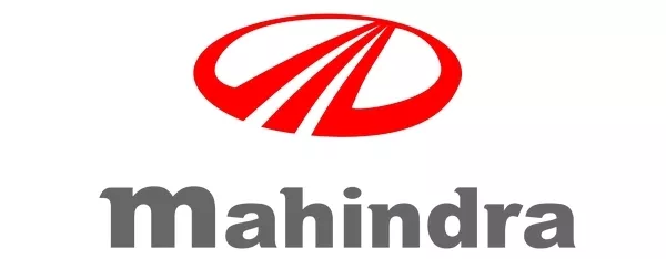
Apart from civilian vehicles, Mahindra also manufactures tractors and military hardware
Mahindra is a Hindu name which means “king”, “God” or “great Indra of the Earth”. Its logo consists of three equal diagonal lines pointing upward and ending at an apex at the tip, looking somewhat like a stylized M. This is said to symbolize three divisions that were established by the company: products, services, and possibilities.
More than that, however, there are three other things that the lines are said to represent: accepting no limits, thinking alternately, and driving positive change.
We have gone through the history of 6 car logos in automotive world. Please keep an eye out for the next part.





![[FOR FUN] Top 5 anime series that car enthusiasts will love](https://img.philkotse.com/crop/94x52/2019/11/06/xgWRvxxG/top-anime-for-car-lovers-5c8c.jpg)
