BMW, Ford, Honda, Hyundai, Kia, Mahindra, Audi, Chevrolet, Isuzu, Mazda, Mitsubishi and Nissan are 12 car logos we introduced in the previous articles. And today is the last part of our series and it is certain that you may be curious about the histories of Subaru, Suzuki, Tata, Toyota and Volkswagen’s logos.
>>> Click to look back on Part 1 and Part 2
13. Subaru
Automotive enthusiasts know Subaru primarily through its use of engines with a horizontal piston layout (also known as a boxer engine), as well as a symmetrical all-wheel drive layout (where power is distributed evenly among all four wheels of the car). This combination has earned Subaru vehicles a reputation for offroad capability, exceptional handling and affordable sports car performance.
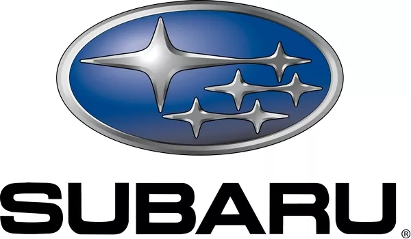
The logo depicts the Pleiades star cluster as a unification of stars, symbolizing the unity of the companies under Fuji Heavy Industries
Based in Tokyo, Japan, Subaru is the automotive manufacturing arm of the transport conglomerate Fuji Heavy Industries (renamed the Subaru Corporation following the success of the brand). FHI started out as The Aircraft Research Laboratory in 1915, involved in aircraft manufacturing up until Japan’s participation in World War II. After the war, the company was divided up by the government into 12 separate entities.
Between 1953 and 1955, five of these corporations decided to merge and form Fuji Heavy Industries: Fuji Kogyo, which manufactures scooters; Fuji Jidosha, which specialized in coachworks; Omiya Juji Kogyo, which built engines; Utsunomiya Sharyo, a chassis manufacturer; and Tokyo Fuji Dangyo, a trading company. FHI’s CEO at the time, Kenji Kita, expressed his desire for the new company to be involved in car manufacturing, eventually naming the new venture Subaru.
The Subaru logo consists of a large star accompanied by five smaller ones in a blue background and bordered by an oval. The biggest star stands for Fuji Heavy Industries, while the five smaller ones are the five companies which originally formed the business. The layout also represents the Pleiades star cluster, which is called “Subaru” in Japanese, meaning “unification of stars”; it is one of the nearest star clusters to Earth, and can be seen by the naked eye at night.
14. Suzuki
Quick-eyed fans of Japanese super sentai shows may recognize Suzuki as among the sponsors, providing vehicles for use by the characters whether in civilian guise or in specialized form. Based in Hamamatsu, Suzuki Motor Corporation manufactures a wide variety of products, from cars, motorcycles, all-terrain vehicles (ATVs) to outboard engines for marine use. The world’s ninth-biggest automaker as of 2014, Suzuki operates 35 plants in 23 countries, apart from 133 distributors in 192 nations, as well as boasting of the third-largest domestic vehicle sales in Japan.
Suzuki had an unlikely start as a company manufacturing looms, founded by inventor Michio Suzuki in 1909. After two decades, Suzuki invented a new kind of weaving machine which he exported overseas and made his company successful. However, he wanted to diversify his business, and decided that making cars was the next logical step, according to consumer demand. The company had prototype compact cars by 1939, but production was halted by the Japanese government, declaring that civilian passenger cars were non-essential to the war effort.
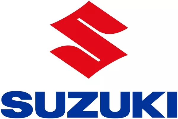
The curves and pointed edges of the logo are very Japanese
In the aftermath of the war, Suzuki went back to making looms. Prospects seemed promising for the company after the US approved cotton shipments to Japan. But when the cotton market collapsed in 1951, the company’s momentum ended abruptly. This presented an opportunity for Suzuki to resume vehicle manufacturing, given the demand for affordable transportation after the war. Beginning with clip-on motors for bicycles, Suzuki progressed to motorcycles, leading to Suzuki Motor Co. Ltd. and eventually to automobiles.
The Suzuki logo consists of a stylized “S” emblem, essentially remaining unchanged since 1958. Apart from standing for the company’s name, the emblem also represents Japan through its sharp edges (reflecting the country’s glyphs), and the original black color was changed into red, which stands for passion, integrity and tradition. The symbol is occasionally accompanied in promotional materials by the Suzuki text rendered in blue, representing excellence and grandeur.
15. Tata
Tata Motors Limited is an Indian multinational conglomerate based in Mumbai, and a member of the Tata Group. TML is generally considered as India’s largest manufacturer of commercial and utility vehicles, with products spanning passenger cars, trucks and buses.
The curves and pointed edges of the logo are very Japanese
It was established in 1945 as manufacturer of trains, before making their first commercial vehicle in 1954, in collaboration with Daimler-Benz AG of Germany. Tata launched the first homegrown Indian vehicle in 1998, and is probably best known for the Tata Nano, the world’s cheapest car it launched in 2008. That same year, Tata Motors acquired the British automaker Jaguar Land Rover as a wholly-owned subsidiary.
Tata’s logo was reportedly designed with help from Wolff Ollins, a well-known branding agency based in London. It consists of two symmetrical white lines bent at 45-degree angles forming a stylized “T” inside a blue oval. The logo represents either a fountain of knowledge or a sheltering tree, as well as fluidity and adaptability. The blue element symbolizes excellence, reliability and the strength of the company’s various products.
16. Toyota
As the world’s largest carmaker (as of 2016), Toyota’s presence is unmistakable. They continue to enjoy commanding sales figures among Pinoy customers who are familiar with Toyota’s track record, even with decade-old models. Worldwide, Toyota leads sales of hybrid electric vehicles, with its Prius line marking over 6 million units sold globally as of January 2017.

The original spelling of the founder's name was altered for ease in writing as well as good fortune
Based in Aichi prefecture in Japan, Toyota was founded in 1937 by Kiichiro Toyoda, spun off from Toyota Industries which was started by his father Sakichi; similar to Suzuki, Toyota Industries began as a company making looms. Even before that, the company had already created its first automotive products: the Type A engine, the Toyota AA passenger car and the Toyota G1 truck.
In 1936, a public competition was launched to come up with a logo for the new company. Out of 27,000 entries, the winning design consisted of three katakana characters spelling “Toyoda” and bordered by a circle. Kiichiro’s brother-in-law Rizaburo, however, wanted the name to be spelled “Toyota”, because it required only eight brush strokes (considered a lucky number) and was visually simpler to look at.
Also, the name Toyoda meant “fertile rice paddies”, so an alternate spelling will remove its association with old-fashioned farming, a must for a company striving to be known for industrialization and innovation. This logo would be used by Toyota for the next five decades, until a new corporate symbol was unveiled in 1989, one that would still be in use today.
The present Toyota logo consists of two overlapping ovals forming the letter “T” inside a third oval. The two inner ovals represent the connection between the heart of the company and that of its customers, and the large oval represents the world welcoming Toyota and its efforts. The entire design is horizontally symmetrical, which makes it instantly recognizable even when viewed from a rear-view mirror.
>>> Read more: 5 most favorite Toyota cars in the Philippines
17. Volkswagen
When Pinoy drivers hear the name Volkswagen, images of the classic VW Beetle, the Brasilia, the Microbus and the local Sakbayan come to mind. Another would be the trademark air-cooled engines with their distinctive sound. Long after the original VW Beetle had been phased out, a lot of local enthusiasts still drive their own Bugs around, gathering for periodic meets and even modding their beloved cars with modern features such as CD players or touchscreen displays.
Headquartered in Wolfsburg, Germany, Volkswagen is the world’s largest automaker in terms of worldwide sales, as of 2016. It was started out in 1937 by a Nazi party, the German Labour Front (Deutsche Arbeitsfront) under Adolf Hitler, out of economic necessity. During the early 1930s, German-made cars were still out of reach of majority of the country’s citizens, as only one in 50 Germans could afford one. In 1934, Hitler ordered that a basic car be produced for the benefit of the populace, one that can transport three adults and two children at a speed of 100 km/h.
The VW logo has remained largely unchanged after World War II
Thus was born Volkswagen, or People’s Car. Since private industries could not manufacture a car at such a low price (990 Reichsmarks or $396 in 1930s US dollars), Hitler sponsored a state-owned manufacturing facility dedicated to producing the proposed car. The use of an air-cooled engine was Hitler’s idea, to avoid freezing even in sub-zero temperatures. Volkswagen would inevitably be involved in producing military vehicles for the Nazis during World War II; it would go on to survive the stigma of war, becoming a symbol of German resurgence in the 50s, peace and love in the 70s, and continuing automotive innovation well into the new millennium.
The original Volkswagen logo in 1936 consisted of a black V placed on top of a W on a white background, bordered by a cogwheel and swastika wings, a clear association to the Nazi party. Shortly before the war, the wings were removed to streamline the design. As the Nazis were defeated, the black and white colors on the logo were inverted, and the cog’s teeth were removed, smoothening the border into a circle.
In the 70s, the logo was rendered in light blue to project a more friendly appearance. The only other significant change to the logo occurred in 2000, when it was updated with a three-dimensional appearance. Volkswagen’s logo continues to endure as an example of simplicity and legibility, at the same time being celebrated as a symbol of the company’s technical excellence and success.
Are there any other car logos – both locally available and otherwise - that you’re curious to know the history of?


